Viral Design: How “Flatten the Curve” May Curb the Pandemic
Why has such a simple (and scientifically incorrect) graph become a symbol of the fight against the COVID-19? It’s about design.

A few nights ago, in my dream, I walked into a dining room filled with suited American dignitaries. Under the chandelier, waiters brought in dish after dish of exotic fowl and snake meat. The dignitaries stared at the dishes clutching knives and forks. Exasperated, I yelled, “Why aren’t you being more careful? Why aren’t you taking this seriously?” Then I awoke.
I write that to illustrate just how much COVID-19 is on my mind right now. Like others, I am gathering information, reading articles, and thinking about the long-term impact of these times (I recommend this article, if you haven’t read it yet). Also, like others, the increasing spread of COVID-19 has commandeered my train of thought. So this article, that started as a manuscript about the unique research center in New Zealand called Designing Out Crime, now includes a story about how “Flatten the Curve,” a graphic posted on twitter recently, became an important part of a the solution to the COVID-19 outbreak. Both the research center and the graphic show that a well-designed solution starts with a well-designed way of looking at a problem. The way you frame the problem that you are trying to solve affects the possible solutions. At Kings Cross, a crime-ridden area of Sydney, researchers realized that one of the best ways to reduce crime was to think completely outside of the box.
Kings Cross and Designing Out Crime
Designing Out Crime, henceforth referred to as DOC, was recently tasked with reducing crime in downtown Kings Cross in Sydney, Australia (for a nice summary, see this academic article). I’ve never been to Australia, but a quick google search provided this context:
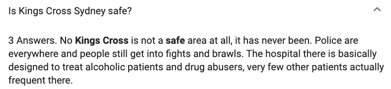
The media and politicians usually referred to the violence in Kings Cross as “alcohol-related” indicating a causal relationship between booze and brawls. Hence, previous efforts to reduce crime revolved around closing bars early and increasing police presence. The efforts failed. Crime continued. So, DOC, recognizing that “police are everywhere and people still get into fights and brawls” set out to reframe the problem.
They thought about the purpose of people who visit Kings Cross and the purpose of the business owners in Kings Cross. Eventually, they formulated a frame to view the location (i.e., they came up with a metaphor to help them think about Kings Cross). To DOC, a place like Kings Cross was similar to a music festival. Visitors came to let loose and take leave of social rules for an evening. Business owners sold and promoted the “live free” lifestyle.
With the new frame in mind, DOC had access to new types of solutions. Instead of cracking down on crime using resources like police officers and rules like curfews, they could borrow ideas from festival planners and behavioral psychologists. They realized that one of the best ways to reduce crime was to simply keep visitors from becoming frustrated or bored. So they added Kings Cross guides who greeted visitors and kept them from loitering. They also redesigned taxi queues, increased the presence of public restrooms, added other entertainment options, and created “chill-out” spaces commonly found at large concert venues. In other words, DOC realized, in the complex social System of Kings Cross, the best way to reduce crime was to throw a better party.
COVID-19 and The Curve
How does DOC reframing Kings Cross relate to COVID-19? To explain, let me tell the story of a graph (much credit here goes to this article in Fast Company #IGotScooped). In pandemic times, government institutions and health care professionals must share information quickly and effectively, without causing overreaction or underreaction. Yet, the institutions and professionals must also compete with sensational news, social network opinions, and sometimes even alternative ideas from varying political and social leaders (e.g., President Trump or Chet Hanks). Essentially, the public is in a state of heightened sensitivity to news and the health care community has a responsibility for sharing better information.
So, how did health care experts successfully start the mantra #FlattenTheCurve? It actually started 13 years ago.
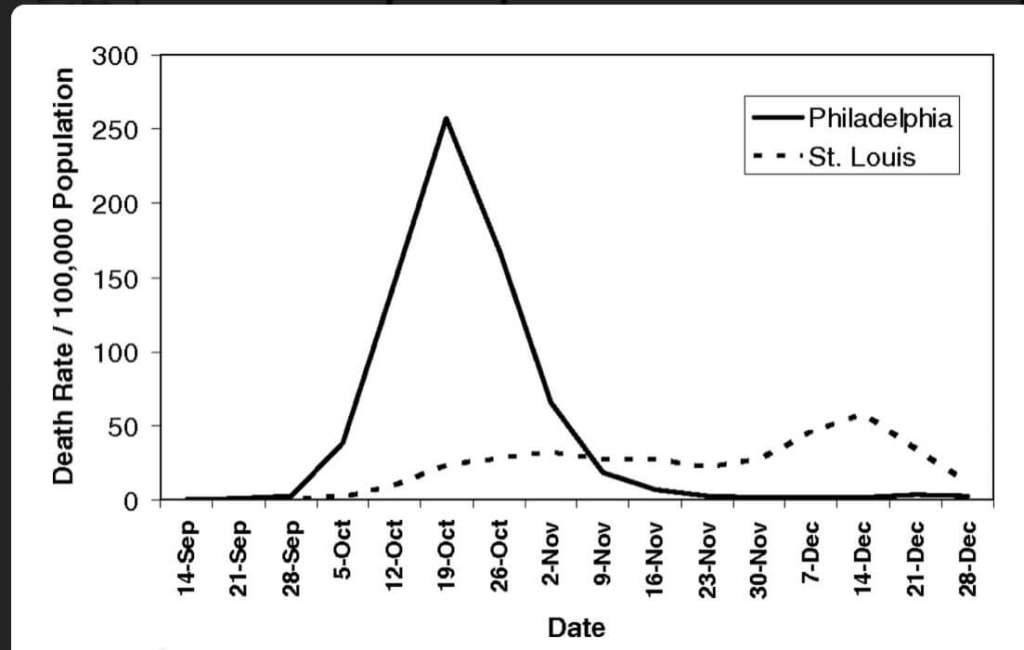
A 2007 conference paper introduced a graph that illustrated the effect of social distancing in an elegant way. It was 1918, and influenza was sweeping through the nation on its way to killing an estimated 500,000–675,000 in the U.S. and 50–100 million worldwide. As doctors reported the first cases, authorities in Philadelphia downplayed the significance and continued to hold major events. In contrast, authorities in St. Louis moved quickly to implement social distancing measures. As illustrated in a graph in the conference paper, the delay in Philadelphia proved deadly (See Figure 2).1
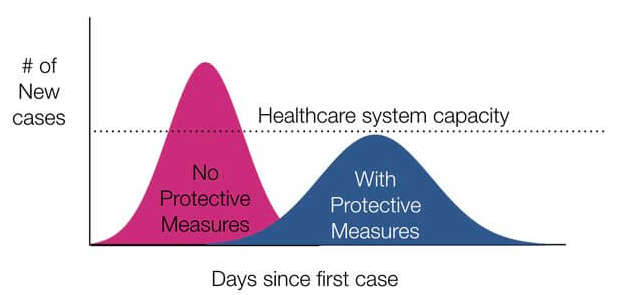
The graph however, did not fall into obscurity after the authors published the conference paper. Later that year, an alternative version of the graph appeared in a CDC pandemic guidance presentation (See Figure 3).2 Same curves, similar idea, but fundamentally different. For the CDC guidance, the graph showed four small, but significant changes:
- The CDC made the graph less specific so it could be applied to future situations. The y axis, for example, changed entirely. Instead of the “Death Rate/100,000 Population,” the new graph read, “# of new cases.” The moves highlight the shifting purpose of the graph. Instead of illustrating a past event, the graph now served as an explanation of the dangers of a “the spike.”
- Then the graph creator added a line showing health care capacity. The line itself is arbitrarily placed at the top of the “with protective measure curve.” The change makes the graph no longer scientifically accurate (as pointed out in this article), but it is meant to illustrate a simple point: reducing spikes reduces deaths. The same number of people get infected, but with protective measures, the healthcare system can handle the capacity.
- Lastly, the graph added colors showing a bad red curve and a better blue curve. Overall, the graph becomes a well-designed piece of advocacy. Based on scientific findings, the graph feels authentic and researched, but also straightforward. The colors separate two distinct situations, one clearly bad, and one clearly better.
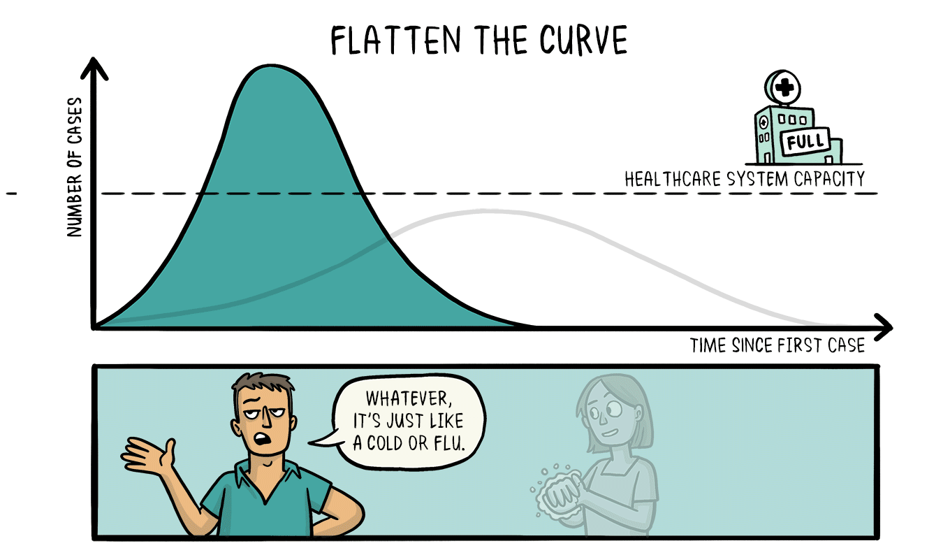
The 2007 graph laid somewhat dormant until Feb 29th, when The Economist included the graph in a briefing on COVID-19. A few days later, Dr. Drew Harris, a population health and health policy educator, posted a hand drawn copy of the curve on twitter and it (excuse my pun) went viral (See Figure 4).
Since then, hundreds of versions of the flatten the curve graphic have been made including ones with cartoon characters washing their hands, animations of the curve flattening (See Figure 5), and even full on live simulations of infection rates based on various social distancing and quarantining methods. The graph has become a hashtag and a battle cry. It has also become something that provides comfort and a feeling of control in uncertain times.
So let’s talk about the design of the curve. Why has such a simple (and scientifically inaccurate) graph become a symbol of the fight against the COVID-19? Think about the problem.
What is the problem with COVID-19? It kills somewhere between .5% and 4% of the people it infects. It spreads more effectively than the seasonal flu. It causes panic. There is no vaccine. It is an unknown. It may mutate. It is preventable, yet we allow it to spread through carelessness. We do not have enough masks. We do not have enough tests. We do not have the right system in place to combat it. It will cripple the economy. It will allow governments an excuse to impinge on human rights. It will allow corporations to collect our personal data, … The list goes on and on.
The problems related to COVID-19 are vast, but in order to design a solution, they need to be framed. The problem needs to be organized, contained, or modeled in a way that allows a solution. The framing of the problem (i.e., how we define and think about the problem) is important because the way we frame a problem determines the possible solutions.
The curve graphic reframed the problem for millions around the world. As citizens, anxious about the pandemic, tried to figure out ways to help and ways to be prepared, the graphic framed the solution as collective action to keep the healthcare system from being overwhelmed. It feels normal now, but at the time it was an astounding way to frame the problem. At the time, people were expecting a vaccine to provide the solution. Or they were expecting to prevent the spread of COVID-19 entirely. If you think about the curve, it is still pretty morbid. The same number of people get infected under either curve which reflects a lot of death in either scenario. The curve is basically cheering for a death rate of ~1% instead of ~4%. This is like going to a sports game and seeing a person in the crowd holding up a poster cheering for the home team to lose by 5 points instead of 20 points.
But it worked. The curve became a phenomenon inciting community action which will likely save many lives. The curve provided useful information about how areas where people take preventive actions fare better despite people still getting sick. The curve shifted the antagonist from COVID-19 to “the spike” in the curve.
Framing Problems
Let me stress that the design of the curve itself (i.e., the graphic design) is not as groundbreaking as the design of the problem and the potential solution that the curve addressed (i.e., the spike is the enemy and the spike is preventable). Reframing problems may be one of the most important and most difficult aspects of design. Well-designed things (like graphics or taxi queues) follow a well-designed problem because a well-designed problem opens up a new world of possible solutions. If the goal is no longer to stop COVID-19, but instead slow its spread, then many more solutions open up.
Lastly, with both the DOC in Kings Cross and the curve graphic, the importance of reframing a problem is evident, but that is not the end of the story. Good designers adjust to the ever changing world. For example, in Kings Cross, a better party environment may lead to overcrowding and a reintroduction of crime. Good designers will continue to monitor and adjust to the situation. Similarly, for COVID-19, there may be cures or vaccines that get developed. There may also be people who ignore the call for social distancing and act as super-spreaders. Good designers need to frame and reframe problems over and over adjusting for the context and adjusting for the development of technology. An infeasible solution may be feasible a month from now, which in turn (like a tail wagging a dog) should change the problem. There is an interplay between possible problems and possible solutions. Good designers must go back and forth between these possibilities like a mental merry-go-round.
So, perhaps the next time I dream about dignitaries chowing down on snake meat, instead of yelling at them, my dream self can try to understand the problem. Maybe they just want a unique meal that could be satisfied with an exotic root vegetable. Perhaps an oyster plant or watermelon radish would do the trick? Maybe they just want to eat something expensive. Could I interest you in this bagel with white truffle cream cheese, goji-berry infused riesling jelly, and (why not?) a sprinkling of edible gold? Perhaps some moose cheese instead? I just need to reframe the problem.
Hatchett, Mecher, & Lipsitch, 2007 ↩
Adapted from: CDC. Interim pre-pandemic planning guidance: community strategy for pandemic influenza mitigation in the United States—early, targeted, layered use of nonpharmaceutical interventions. Atlanta, GA: US Department of Health and Human Services, CDC; 2007. https://stacks.cdc.gov/view/cdc/11425 ↩
https://twitter.com/drewaharris/status/1233267475036372992 ↩
Flatten the Curve by Siouxsie Wiles and Toby Morris is licensed under CC-Share Alike 4.0 ↩
Bravo! Great article. informative, yet conversational and consumable. I am going to share this. THANK YOU!!!
Thank you! Much appreciated!