Designing Experience: A Case Study of Disneyland’s Lines
Some things we design are intangible. Disney’s Imagineers took a universal experience–standing in line–and re-mixed it to fit in the happiest (?) place on Earth.
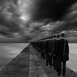
Which picture best matches YOUR Experience of waiting in line at Disney? Let us know in the comments!
Experience A:
Experience B:
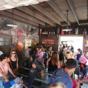
Experience C:
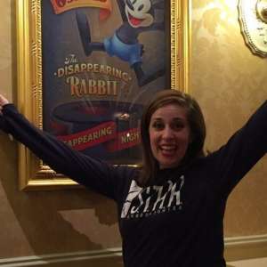
Waiting in a line. Few other annoyances seem to have the same omnipresence for disturbing such a wide range of our lives more than waiting in lines. From paying for groceries to going on a bucket list vacation, we’ve all had time and energy drained by these ubiquitous thieves that stand in the way of what we want. Typically, waiting in line is made bearable only by the promise of “getting” what is at the end of the line. But sometimes, no matter what it is we “get” at the end, we can still walk away with different impressions just from the experience of waiting (or not) in a line. It was this particular problem of waiting in lines that plagued the designers of the self-titled happiest place on earth: Disneyland.
When Disneyland opened in 1955, Walt Disney introduced the world to a revolutionary type of attraction, one which brought the experience of movies to the physical world. The designers and staff (respectively known in Disney parlance as “imagineers” and “cast members”) put on a theatrical experience, or in other words, a show. However, this type of show required all sorts of pragmatic considerations such as parking, eating, going to the bathroom, and riding the main attractions–all of which involve waiting in lines.
The lines at Disneyland in the first year were a disaster; they turned happy guests into frustrated tourists. The booming United States’ economy at the time led to more tourists visiting the country and, along with this, more guests at Disneyland. The increase in guests was indeed a good problem for Disneyland to have, but it created several other problems such as (surprise!) long lines. In response, the imagineers introduced a novel solution. They would move their lines from single and outstretched lines into a serpentine and compact lines, known as “switchback queues” such as the one illustrated below.
In a previous post we briefly discussed switchback queues:
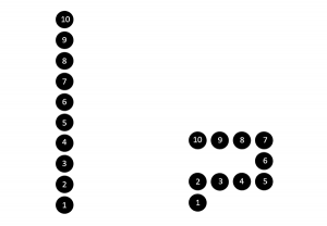
“This simple change, revolutionary at the time (in fact, Wendy’s, American Airlines, and Citibank all stake claim to the invention)2, did not change the actual length of the line or the waiting time. However, instead of one long line where guests don’t see each other’s faces, they redesigned it as several short-looking lines that fold around each other, with the added benefit of ‘people-watching’. This redesign made lines more conducive for interactions with other guests. In other words, despite waiting the same amount of time, the experience of waiting in line made guests happier because the imagineers disguised its length and provided opportunities to socialize face-to-face with other guests while waiting.”
Not only did switchback queues help present an appearance of smaller lines and provide more opportunities for interaction between guests, they also freed up more park space by fitting more people into smaller spaces. Reimagining what a line can do, however, did not stop at a switchback queue.
By the 1960s, as imagineers added more attractions that boosted overall attendance, they decided they needed to rethink the line experience. They made the experience of lines more comfortable and more informative by employing processes and artifacts such as locating lines indoors, introducing roving food carts, and placing signs with estimated wait times. More importantly, they reimagineered lines as part of the ride experience instead of a separate activity that disturbed the main experience. They did this by incorporating the line for a ride into the ride’s theme. Some rides included lines in which guests progressed through a storyline as they walked. For example, the line for the haunted mansion ride started guests in an outdoor cemetery, then brought guests into an indoor pre-show, then finally into a haunted corridor for loading onto the ride. By the time guests boarded the main ride, they had been part of a show that built toward a climax: the ride itself.
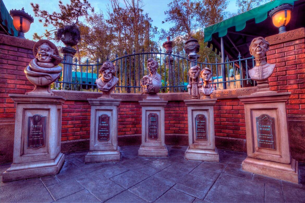
Additionally, imagineers tweaked and tuned the line waiting experience to temper expectations. Humorous rides featured humorous line experiences, such as a radio that told bad jokes before the jungle cruise ride. Even the colors of the waiting rooms hinted at the experience of the ride. Guests who waited in bright colored rooms and hallways could expect a kid-friendly ride. If the color scheme featured darker colors, guests could expect to be frightened or thrilled.
This attention to detail illustrated how the imagineers perceived the problem of line experience design at Disneyland. The problem could have been framed as an efficiency problem (how can guests be moved more efficiently?) or an experience problem (how can guests be happier?). Eventually, the imagineers settled for framing lines as an experience to be improved on. To do so, the imagineers drew on psychological insights that helped them improve the experience of waiting in a line. For example, they no longer exclusively worried about wait-time, but also focused on the perception of wait time, approaching line-waiting as part of the theme park experience. Some of these psychological insights came in the form of the four principles that created an “ideal queue”3
- a fair wait–a first come, first served rule
- a comfortable wait – basic needs are met such as having bathrooms available
- an understood wait – start with the why; waiting should make sense
- a known wait – provide customer with estimated wait times
But what if they could eliminate lines altogether? Disneyland tried to eliminate lines, but not all plans went well. In 1999, Disneyland introduced the FastPass System. This system invited guests to take tickets with a printed time of entry so they could leave and return at the appointed time with no wait at all. The system increased ride efficiency almost 40%, since guests could take a FastPass ticket, go on some other attraction and then return in time to ride without waiting in line. Yet, FastPass brought about unforeseen challenges which pushed imagineers to question its success.
Guests worried about getting back and forth in time to squeeze the best experience out of the park. “It was almost like a hamster trail to run through to get FastPasses, then go to another attraction, only to return later,”4 stated one customer. Ironically, the FastPass system seemed to negatively impact the park experience because guests focused on getting to all the rides at the right time instead of accepting the peaceful resignation of being “stuck” in well-designed line experience. In fact, many guests who grabbed a FastPass ticket did not run to another ride, as intended. Instead, they loitered in open spaces and blocked the movement of other guests wandering to and from, all while they waited–bored–for their FastPass time to arrive.
Unintended consequences, like the loitering behavior of FastPass users, highlight the importance of testing a design for an experience. No type of design, from a teapot to a governmental system, takes place in a vacuum. New designs stand by themselves while also depending on and impacting what happens across contexts and design spaces. As these line re-designs by Disneyland illustrate, design decisions often unpredictably affect the greater ecosystem in which they reside. Thorough designers try to predict these shifts, but they also accept that predictions can go awry.
Takeaways
Lastly, this example of Disneyland’s lines illustrates that, although there are indeed many tangible things that are and can be designed, designers design more than just tangible things. The design of intangible things, such as the experiences of waiting (or not) in lines, can involve the use and/or the design of objects such as readable signage. However, these tangible things are employed in the service of designing the real goal: the wider experience itself. In many ways, the design of an experience relies and builds on a combination of artifacts. That is to say, design spaces can build on and rely on each other.
So, it might be fun if the next time you find yourself in the experience of waiting in a line, you try to find the tale-tale signs that someone has tried designing that experience in some way. Maybe the line is a switchback queue, or it has a displayed estimated wait time, perhaps the line is located in a more comfortable or efficient spot such as in a shaded area or close to an entrance/exit; maybe it employs a feature that not even an imagineer has thought about yet. These are all intentional attempts at designing not just a tangible thing, but an intangible experience.
1We made the editorial decision to place the trademark symbol here in order to emphasize that these words are designed and trademarked by Disney. The motto itself is an example of how Disney, as a company, meticulously designs the experience of their customers.
3Stevenson, S. (2012, June). What you hate most about waiting in line. Slate.
3Meister, D. (1985). The psychology of waiting in lines. In Czepiel, Solomon, Suprenant (Eds.), The Service Encounter. D.C.: Heath and Company. Lexington Books.
4Nelson, E. (2016). The art of queueing up at Disneyland. Journal of Tourism History, 8(1), 47-56.

Experience B is what I think of at Disneyland–there’s almost this mismatch between the annoyance of standing in line and the decorative elements. I definitely don’t feel Experience C, and it is a bit more interesting than Experience A.
I find the need for lines interesting–several years ago I was visiting Cedar Point in Ohio and there were hardly any lines. I went on rides so many times that I got quite sick of them–literally–I had a major headache from too many roller coasters too close together. I realized that as much as we hate lines, they do break up the amusement park experience, building anticipation for actual time on the ride.
Nice! I think it is B for me too. Though I think the lines are starting to get closer to C. Most recently, I was in line with a talking AI-powered Mr. Potatohead at Disney World. The robot could recognize and call out people. “Hey, you with the hat!” then crack some joke. It was so entertaining that I didn’t want the line to move past.